Google Messages, Phone by Google, and Google Contacts get new, updated icons.
Google has updated the icons for Google Messages, Phone by Google, and Google Contacts to improve visual clarity and consistency across its app suite.
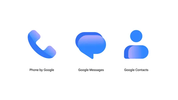
Google announced refreshed icons for Google Messages, Phone by Google, and Google Contacts, designed to enhance visibility on home screens. The new icons incorporate sharper edges, clearer gradients, and updated curvature to align with Google’s broader app design language. The changes reflect user feedback aimed at improving visual recognition and consistency. Functionality remains unchanged, ensuring no disruption to daily use.
The updated icons feature subtle gradients and refined edges to improve legibility against various backgrounds. The redesign aligns with the styling of other Google apps, such as the core Google logo, for a cohesive look. These adjustments are part of ongoing efforts to modernize the visual identity of Google’s core applications. Users will notice the changes gradually over the coming weeks.
The refresh does not alter the core features or performance of the three apps, which continue to operate as before. The visual updates are purely aesthetic, intended to make the apps easier to identify on a crowded home screen. Google emphasized that the changes were made based on community input to better meet user needs.
For additional details or to share feedback, users can visit the official Google community forum. The rollout will occur gradually, ensuring a smooth transition for all users. The company did not specify an exact timeline but indicated the updates would arrive in the coming weeks.