5 design principles we use to put creators center stage
YouTube outlines five design principles to reduce clutter and prioritize creator content across its platform, including simplifying Shorts creation flows and improving cross-device consistency.
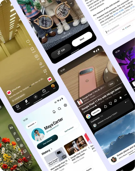
YouTube’s design teams aim to reduce visual distractions so creator content remains the focal point of the interface. Recent changes include relocating product overlays below the video player to minimize obstruction, ensuring creator work is not overshadowed by competing elements. The adjustments reflect a broader effort to streamline the viewing experience by removing intrusive design choices that could detract from the primary content. These refinements are part of an ongoing process to make the platform feel more intuitive without disrupting established user habits.
The Shorts player has undergone adjustments to dedicate more screen space to videos by condensing titles and reducing right-hand icons. Actions deemed less essential have been removed or repositioned to keep the interface uncluttered. YouTube analyzed usage patterns to identify which features were most valuable to users at specific moments, applying these insights to simplify the Shorts experience. The goal is to ensure that only the most relevant tools remain visible, allowing the video itself to command attention.
Creation flows for Shorts have been streamlined by eliminating redundant steps, reducing the number of actions required to publish content. YouTube removed unnecessary navigation points and redesigned the layout of action buttons to improve visibility and cohesion. These changes were implemented to make the creation process more efficient, enabling users to share content with fewer obstacles. The adjustments also include adjustments to how video titles are displayed to prevent them from being obscured by advertisements.
YouTube emphasizes consistency across devices by using shared design patterns, icons, and layouts to maintain familiarity whether users are on mobile or a television. This approach ensures that features function uniformly across different screens, reducing the learning curve for new tools. By adhering to these principles, YouTube aims to create an interface that feels natural and responsive, prioritizing usability and creator visibility in every interaction.